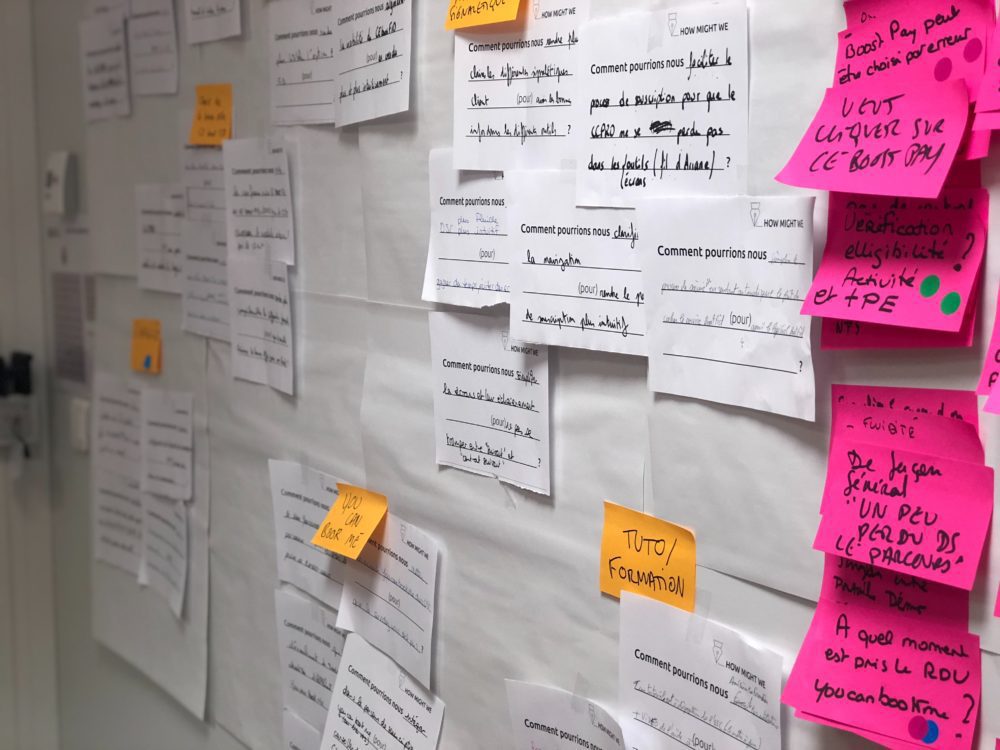
“I don’t like it, but I can’t really say why.”…..“Once I see it, I will be able to tell you if it is what I had envisioned.”…..“I can tell you what I don’t like about it.”
We all heard this feedback from clients before, or even our own internal teams. Design reviews take patience and understanding, but if run well, are certainly an invaluable source of feedback. But what makes a good design review and how can you get the most out of it to elevate your digital learning experiences?
What Is a Design Review
Just to be clear, I’m not referring to instructional design here, but the design of the digital learning experience overall (something overlooked too often): the graphic user interface (GUI), images and photographs, buttons and icons, the user flow and the user experience all of these elements create. First and foremost, the design of any digital learning experience needs to be evaluated against project requirements and outcomes. Yes, it’s not just the content and the instructional design, but the design overall!
Usually, design reviews can be found in product development, but with learning experience design on the rise, L&D professionals should take a good look at this practice. It is a step in which design and development work together and talk about sketches for page layouts, mock-ups of icons and imagery to get feedback on all of these design decisions. It’s not a pitch, but a process to evaluate and critique current design work.
How Do I Conduct a Design Review?
Design reviews are best conducted in a face-to-face or virtual meeting. It’s imperative for the teams to be together, discuss and evaluate work to date and agree on next steps. A design review cannot be conducted through email or instant message. You might be able to share some additional thoughts after a design review meeting, but ensure you make the time to meet in person first. It’s worth it.
It can be helpful to decide on a formal process that supports collaboration, creates a productive environment, is repeatable and most important of all, leads to an improved design. Some rules you could incorporate include:
- Have at least one design review session per project
- Have no more than 6 people in one session
- Bring in different people all the time to broaden point of views
- Bring in people that aren’t familiar with the project to get a fresh perspective
- The primary designer should lead the session
Steps to Take Before a Design Review
Most important of all, the lead designer needs to keep the session moving and under one hour. That means, organization and preparation are key. Once the people that need to attend have been chosen, send a meeting invite and state the overall project overview, the goals and outcomes, as well as timelines, deliverables and constraints. This way, everyone can come prepared to the session. It might be helpful to create a checklist or template to ensure all points are hit. Before the session starts, ensure you have everything ready that you want to show, including mock-ups, prototypes and examples from other projects that could help inspire the team.
Steps to Take During a Design Review
To start the session, the lead designer should state the goals of the design review and what she hopes to achieve at the end of it. Ideally, limit the number of outcomes per session to really focus on only a couple of elements instead of trying to save the world all at once. It is best to write the outcomes on a whiteboard for everyone to see. Question to cover could include:
- What are the first impressions from a 1-second or 5-second test?
- What do we want the learner to do on this page?
- Is that call to action obvious?
- What happens if we remove a section?
Participants should be given ample time (15-25 mins) to explore materials, prototypes and mockups themselves without interruption before going into a productive discussion. Encourage them to take notes throughout, prioritize their feedback, and focus on the end user experience.
Then it’s time to dive into the discussion. Everyone in the room gets to share one piece of feedback at a time; the group then discusses it before moving on to the next item. Capture all feedback in digital format so it can easily be accessed later. No decisions are made during this step. Not everyone will always agree on everything so here are some tips to keep the session moving:
- Avoid feedback that’s subjective or emotional
- Don’t let discussions drag and one person dominate the room
- If people disagree on an idea, write it down for later
- Have participants vote on ideas
- Not every feedback is good so plan to disregard ideas
With ten minutes to spare, wrap up the session and let everyone know that notes will be shared. This way, participants can add more feedback if they wish.
After The Design Review
The lead designer needs time to iterate and think about each piece of feedback. The designer makes the call on what feedback to keep and what feedback to disregard. Remember though, you are not your design so check your ego at the door and really listen to the valuable feedback that was shared. Prioritize the items you wish to change and turn them into actionable items to be addressed by the appropriate people.
A well-organized design review not only supports collaboration within your team, but helps to strengthen your team overall as well as the learning experience. You might even consider adding your clients or learners to these meetings. Designers might find it challenging in the beginning to run design review sessions, but over time, they will be an invaluable tool in your toolbox to help you elevate digital learning experiences.
Tags: Design Thinking, Learning Experience, Usability, UX/UI
Trackback from your site.
